Alena Alexandrova is a cultural theorist, independent art curator and professor based in Amsterdam.
Writing in the realm of culture and arts is at the core of her work, while the subject of «framing» —in a broad conceptual sense— is a key aspect in her research. Having known Alena for a few years now, I’ve also noticed her interesting slanted, cursive, classic, and very personal handwriting style.
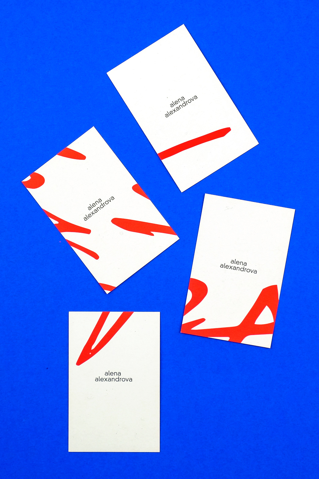
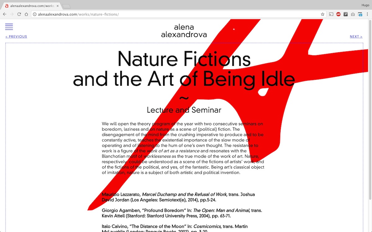
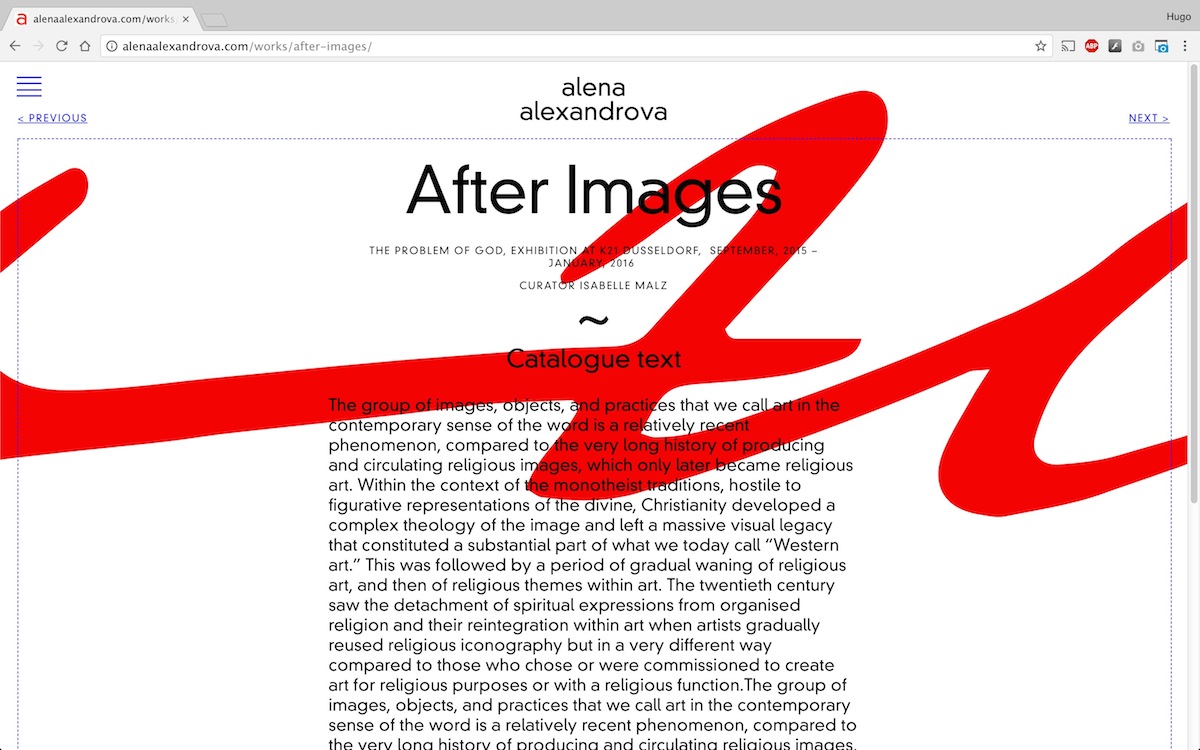
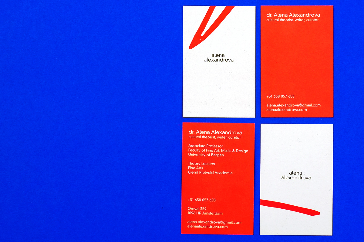
I wanted this identity concept to gather from both, her personal expression, and her studious approach to academic research. Hence the choice to incorporate the expressive handwriting strokes, paired with a normative, geometric and legible typeface from the Bauhaus era —a DIN variant that nowadays may feel both neutral and flavoursome—; the idea of cropping, positioning and framing objects; the subjectivity of artistic meanings; the association of her name and the affinity of her personality with the colour red.
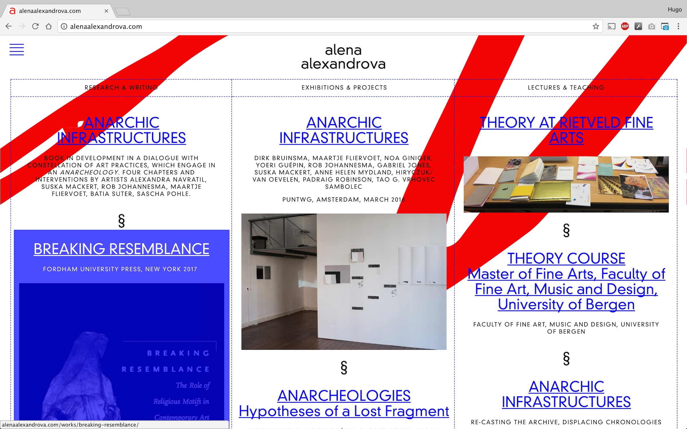
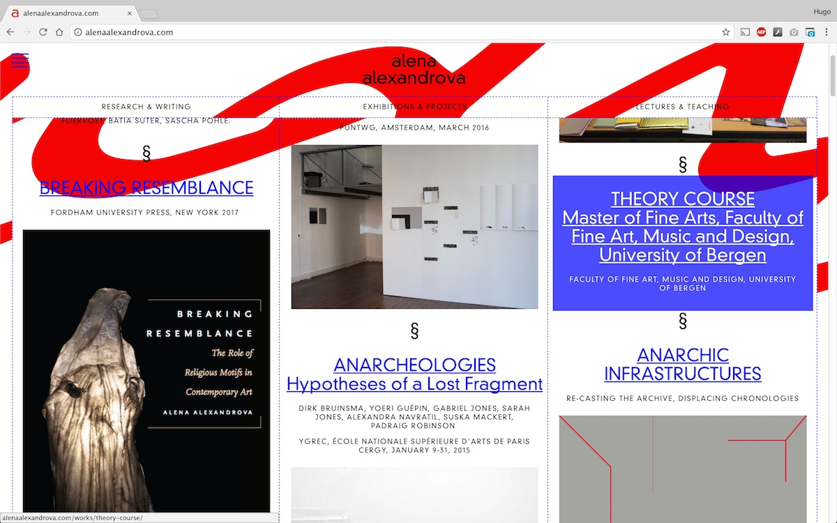
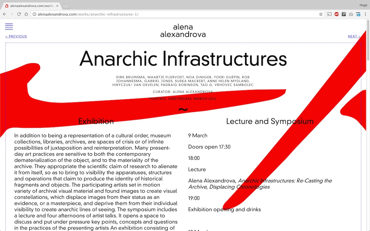
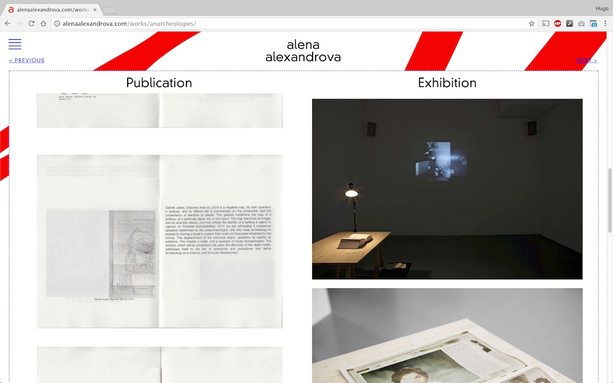
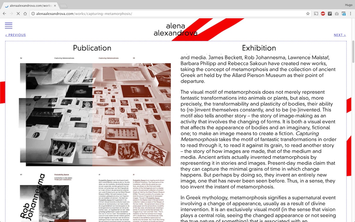
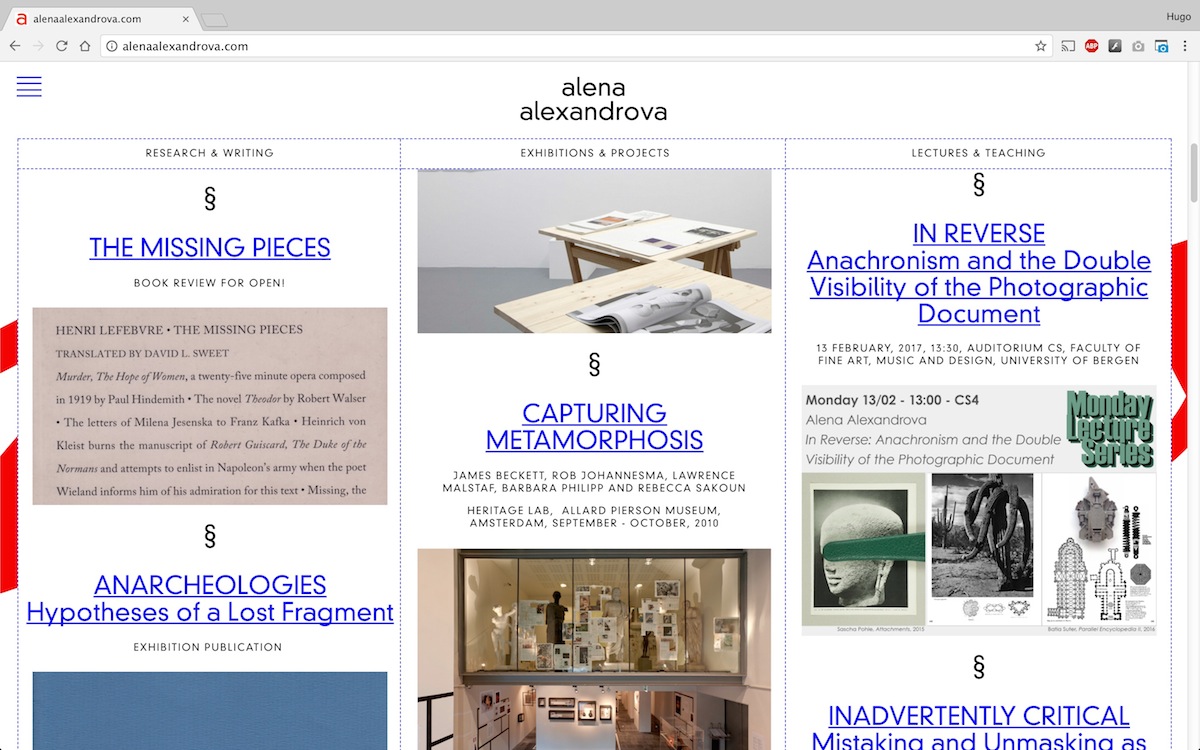
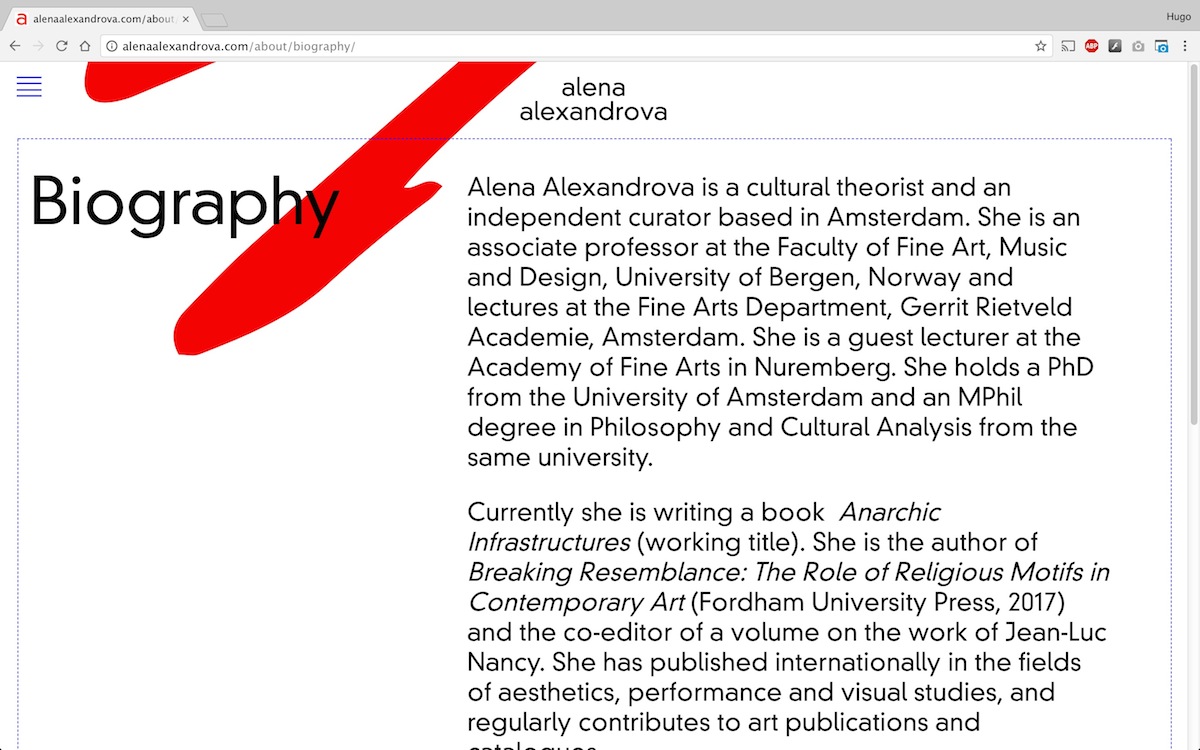
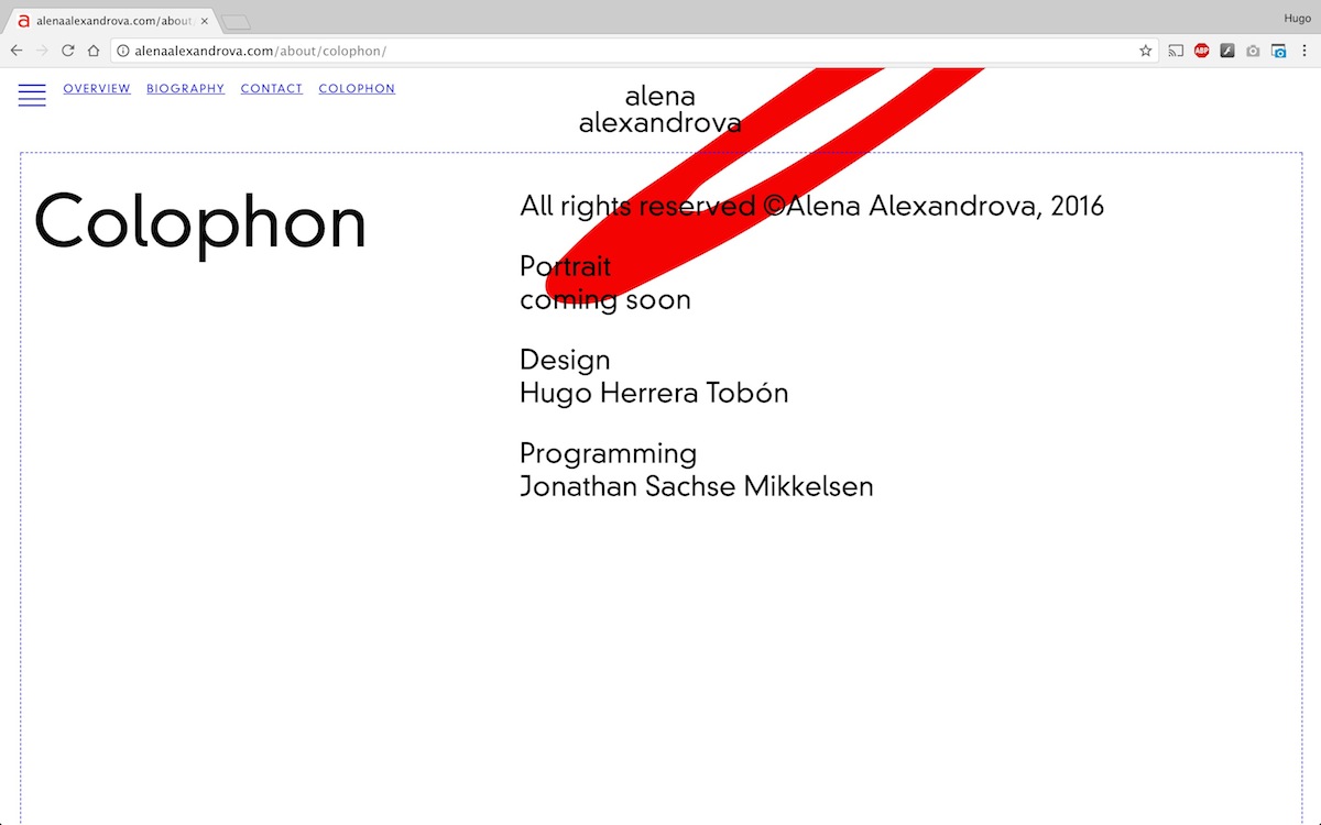
The website design is largely based in a contrast between typographic sizes; classic html red, blue & black; a random set of her signature croppings as backgrounds displaying upon load of the different sections, and a simple three column grid that classifies her projects by category. The website was also designed to be fully responsive on mobile platforms. Her business cards, were designed in 4 kinds, making use of some of the above-mentioned croppings and a simple but personal design.
Graphic Identity, 2017
Website design (desktop & mobile)
Programming by Jonathan Sachse Mikkelsen
Business Cards: 85×55 mm, offset printed in Black & Pantone, on 350gr. «Cyclus Offset» recycled paper.
Typeface: DIN 30640 Std Neuzeit Grotesk Light, designed by Wilhem Pischner at the Deutsches Institut für Normung in 1929
alenaalexandrova.com