NJSO, Dutch National Youth String Orchestra
Amsterdam, 2017 – 2019
Identity & Website (2017 – 2019)
Graphic identity facelift (2017)•Logo variants•E-mail signatures•Social media profiles•Website design (desktop & mobile)•Programming by Jonathan Sachse Mikkelsen
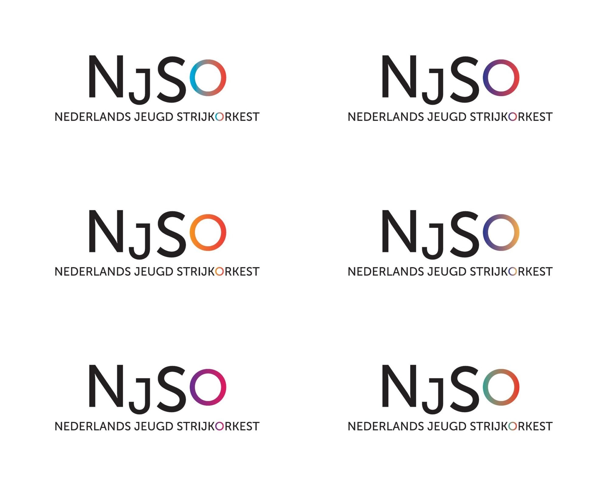
In 2017 the identity of the Nederlands Jeugd Strijkorkest received a facelift: the letters N, J and S turned black and the colour gathered in the «O» — the only vowel in the acronym — as a gradient, a sign of sound, surprise and openness. It was issued as a set of logo variants and applied to the posters, e-mail signatures and social media profiles.
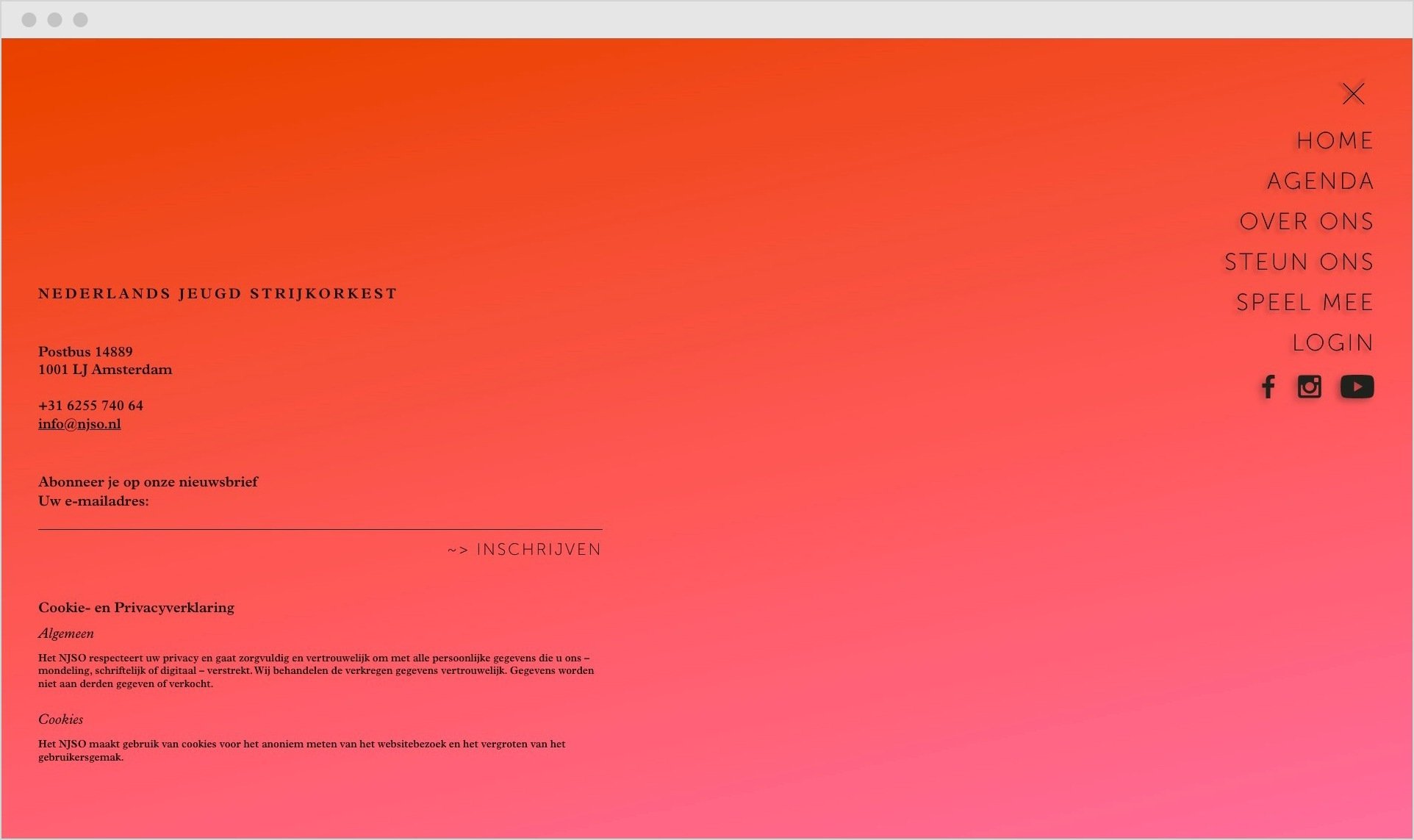
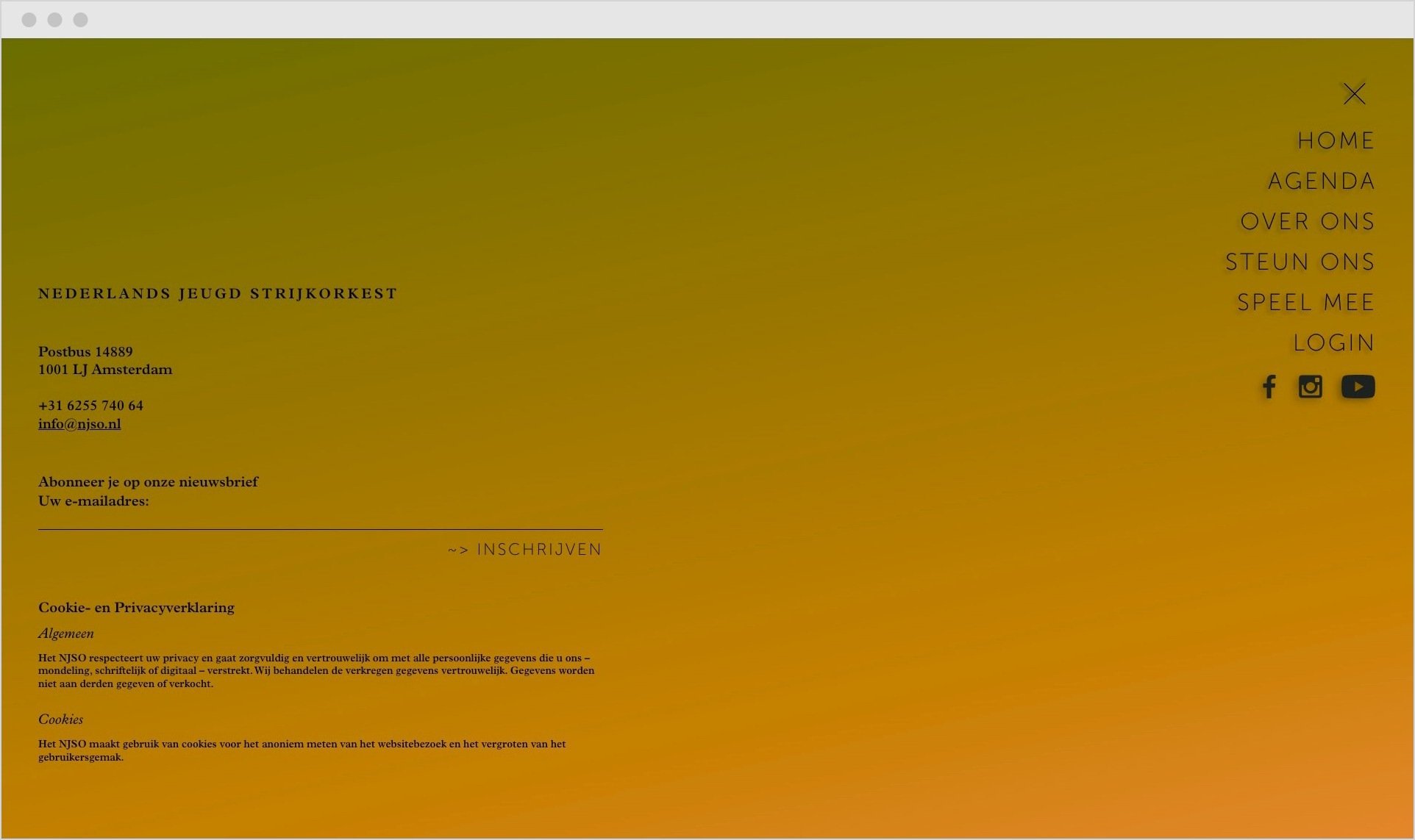
In 2019 we launched a brand new website that came to replace the one we had designed together back in the day. The newer responsive website features an animated never ending colour gradient loop, that hues and hints the youth and colourful vibe of this formation, yet remaining true to the classical tone of their music.